Olympic National Park Camping Showcase
Intro
Highlighting the many camping opportunities offered by Olympic National Park, this showcase shows visitors where and how they can stay in the park to experience the pristine northwest wilderness.
Problem
Olympic National Park has an official site (hosted by the National Park Service), but the camping section is buried and, while informative, rather dry. I wanted to consolidate that camping information into a compelling pitch. The new site should also be responsive, and include a CTA that encourages users to sign up to a newsletter that can help the park engage readers after they’ve left the site.
Solution
My solution was a single page showcase focusing on the many campgrounds located in Olympic National Park. Each campground is described individually, and the page includes helpful tips describing how to get the campground and what kind of amenities to expect. I added a reviews/testimonials section to further sell the reader on that park’s natural beauty. Finally, call to action sections were added to encourage users to sign up for a park newsletter to keep them up to date on the latest park news.
My Role
This was a practice project during my Bloc UX Design course. I performed the UX, design, and development roles. My mentor, Kurt Cunningham, played the role of senior designer, guiding my designs with helpful feedback.
Process
Research
I began the project by researching the park to get a better feel for what made it unique. I collected photos to give me a feel for the park’s natural aesthetic, and dug up past visitors’ testimonials to help understand what details about the park really connected with them. I conducted online surveys querying random people about what they’d like to see in a page about a national park. That feedback helped guide my decision to add a newsletter sign up section, as knowing about park news and programs and schedules were among the most commonly requested site features.
Logo Design
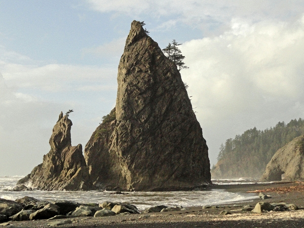
For a logo design, I chose sea stacks. Dotting the park’s Pacific coast, these large rocky formations jut out of the water in dramatic fashion and are among the park’s most unique features. I developed two different sizes of logo: one large, with details showing the rocky texture of the sea stacks. The other logo was simplified, designed to work in smaller sizes or wherever low fidelity was necessary, such as print or apparel.


Design Iterations
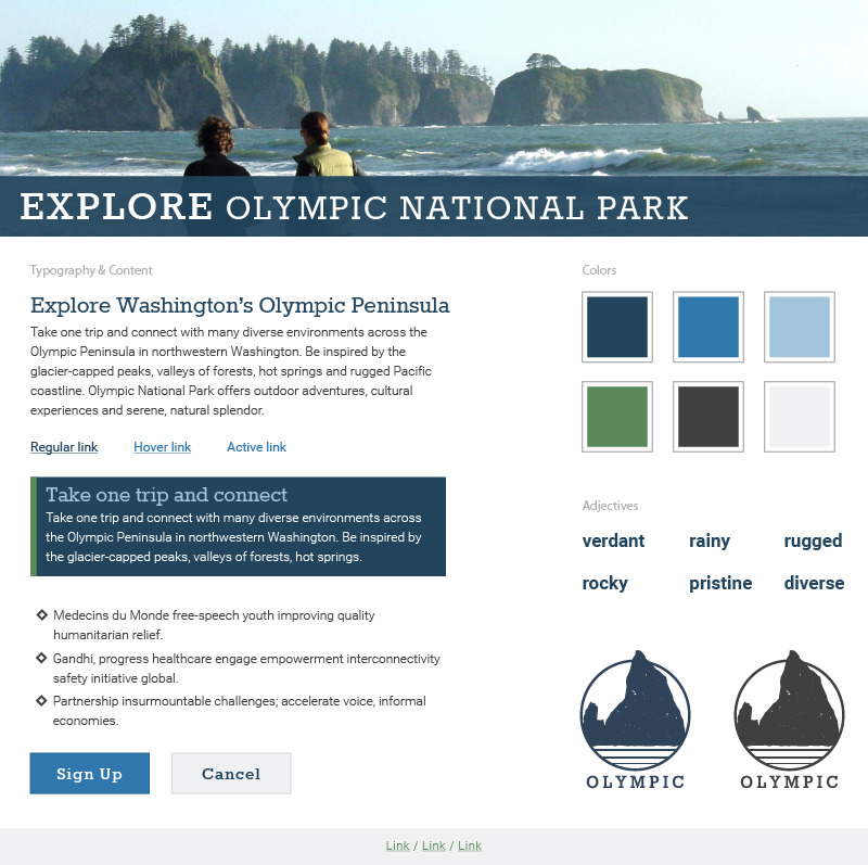
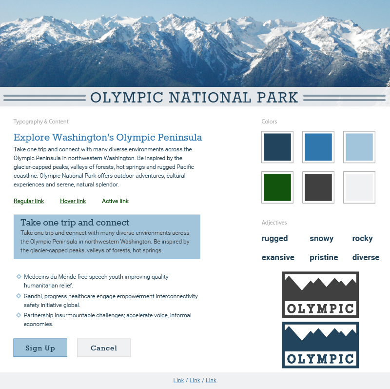
The design moved through four iterations. Along the way it progressed from an attractive but too-sterile presentation, through a couple layout changes, and then to the final style. The design has an overall retro feel. Earth tones dominate the page, including a strong dark green and a neutral tan. Bright orange is used for attracting the user’s attention, such as for CTAs. Striped fonts form a 3D effect on major headers that adds vigor to the page without straying from the retro theme.


Build
The website was built as a single, responsive page. Following conventional UI patterns, I implemented a fixed header that scrolls with the user to provide in-page navigation. In tablet and wider views, all navigation options are present by default. In mobile views, the navigation options are hidden initially and visible after the user opens a nav menu (through a typical hamburger icon). Much of the content is presented in two columns, and those same sections are collapsed into a single column in mobile views. The campgrounds are shown using a card UI pattern, allowing the number of campgrounds shown in one row to scale based on the viewport width.


