FundRally
Intro
FundRally is a conceptual design for a crowdsourced fundraising platform. FundRally is designed to be a platform for established charities to launch digital fundraising drives for specific projects.
Problem
Public fundraising for charities is a necessary but difficult task. Fundraising over the internet expands a charity’s reach but also introduces a disconnection between the charity and the donors. Donors have heightened concerns about trustworthiness and want extra transparency to ensure accountability. Donating through a digital platform can also lessen a sense of community and connectedness amongst donors. Donors want to know where their money is going, and that the projects they fund will have a real impact.
Solution
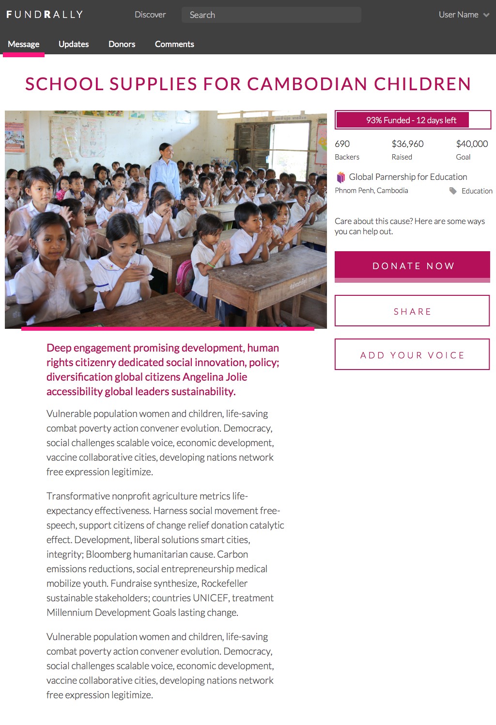
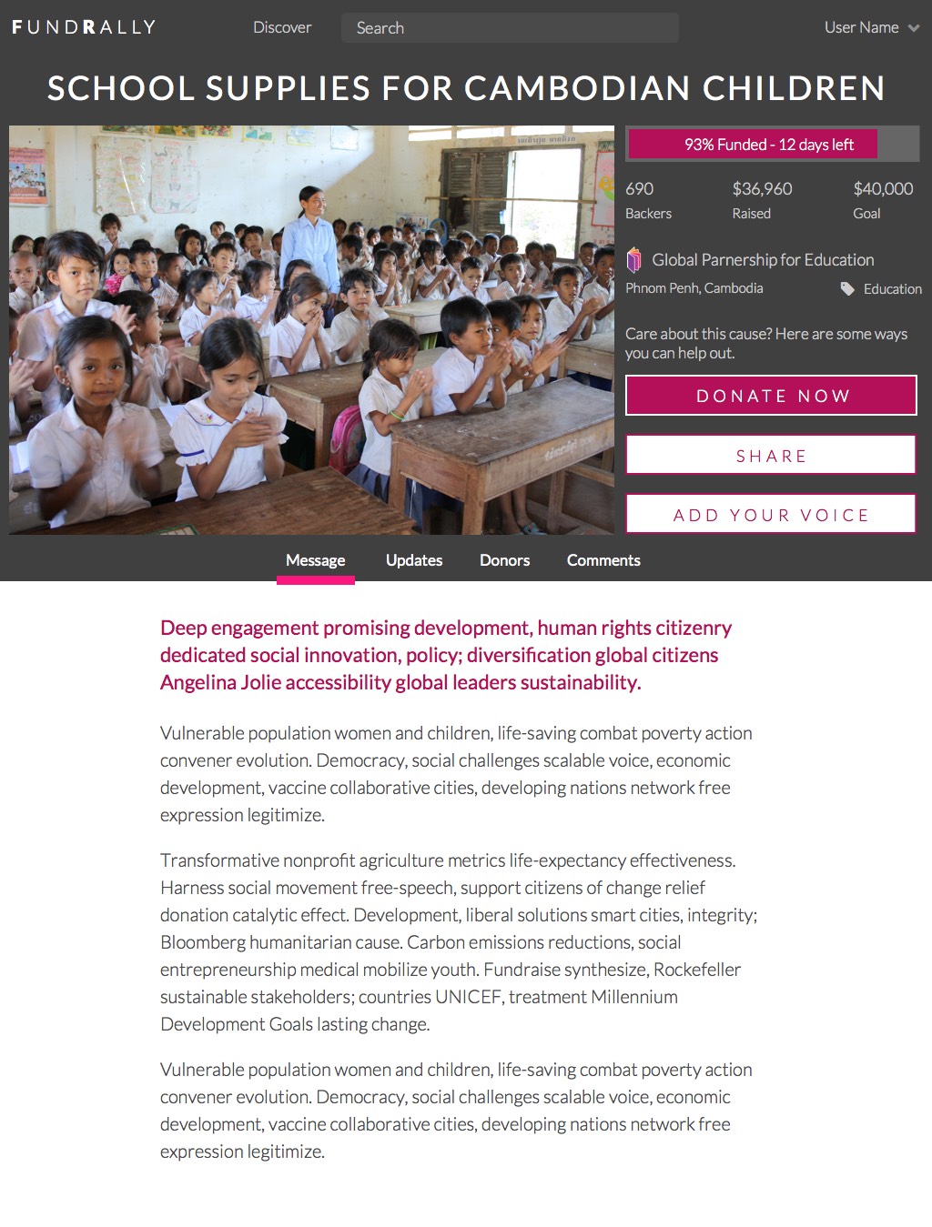
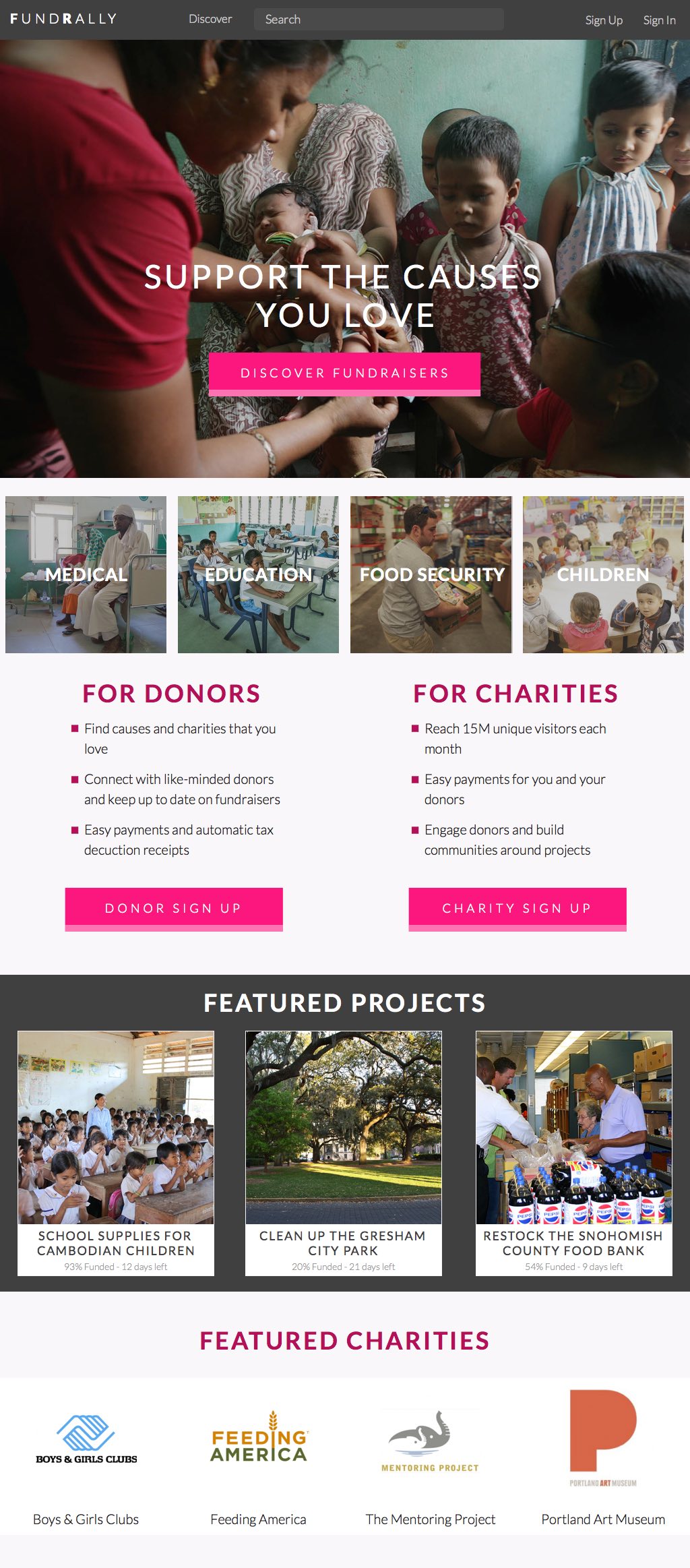
Developing the solution for FundRally began with defining what the site’s concept would be. I developed and documented a vision for the site that focused on enhancing fundraising trustworthiness and transparency. From that document I developed a set of user stories necessary to provide FundRally’s core functionality. I created mockups for the every page needed to support the user stories.
My Role
This was a practice project during my Bloc UX Design course. I took on the business analyst, UX, and design roles. My mentor, Kurt Cunningham, played the role of senior designer, guiding my designs with helpful feedback.
Process
Vision Definition
My work on FundRally began with developing the concept of the site. After researching other fundraising sites, such as Kickstarter, DonorsChoose, and IndieGoGo, I settled on a concept centered around fundraising for established, recognized organizations. Unlike peer-to-peer crowdfunding sites, on the FundRally platform fundraisers could only be created by federally recognized organizations. Limiting the fundraiser participants in this way helps to encourage donor confidence in fundraiser accountability and effectiveness.
Fundraisers are required to be for specific projects. Focusing the fundraiser encourages charities to clearly define the specific mission of the fundraiser. Clearly defined fundraiser goals also help donors understand what the impact of their donations will be. Fundraisers have funding goals and definite time limits, set by the organization at the time of fundraiser creation. Those fundraisers that meet the goals are funded, while donations to fundraisers that fail to meet the goals are refunded back to the donors in the form of site credit. This assures donors that if their money is committed, it’s committed to a project that has enough funding to be successfully implemented.
Throughout the fundraiser, the charity can reach out to donors with status updates and other messaging. After the fundraiser is successfully funded, the charity can send donors thank you notes and also keep those donors up to date on the status of the funded project.
The full text of my conceptual outline for FundRally can be found here.
Requirements & Use Cases
After developing the vision for FundRally and roughly outlining the desired functionality, I wrote user stories to document the expected functionality and decompose those general requirements into specific use cases. User stories were divided into the site’s two major user roles, donors and charity representatives, as well as guests that had yet to be identified with either role. To help clarify the requirements for fundraiser page details, I also wrote individual user stories for each significant piece of information needed for those fundraiser pages.
The full user stories can be found here.
Design Iterations
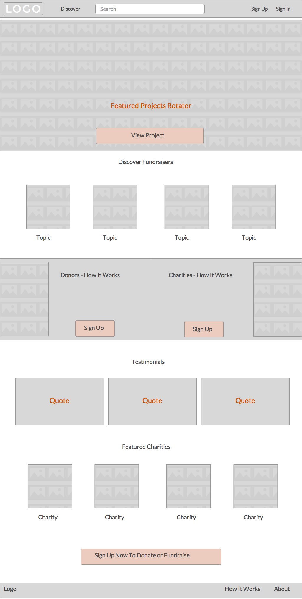
Site design began with very low fidelity wireframes developed in Sketch. These helped to lay out the information on each page, and also served to verify that the user stories covered all needed functionality. As these wireframes exposed holes in the user stories collection, new user stories were added to document the newly discovered requirements.
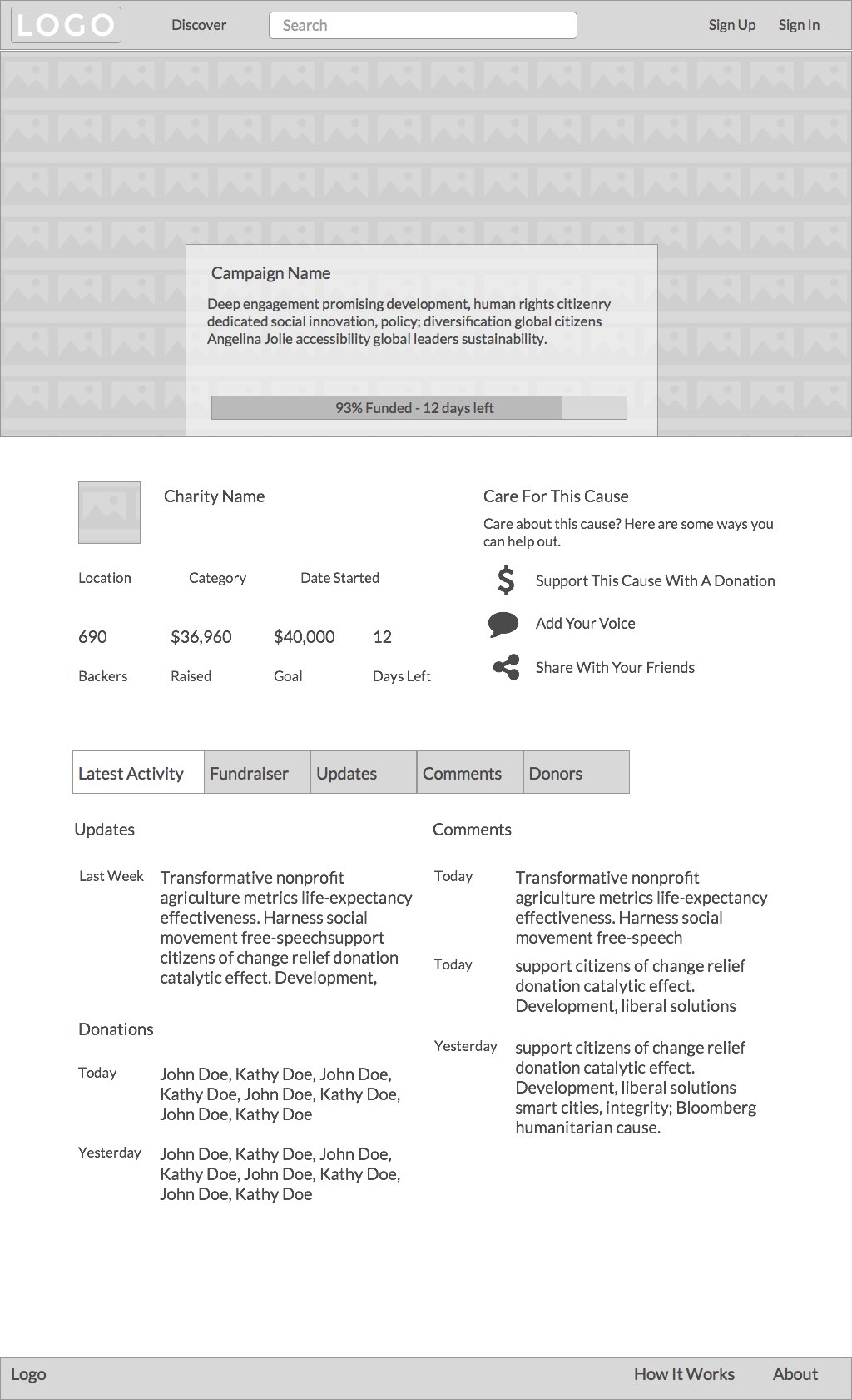
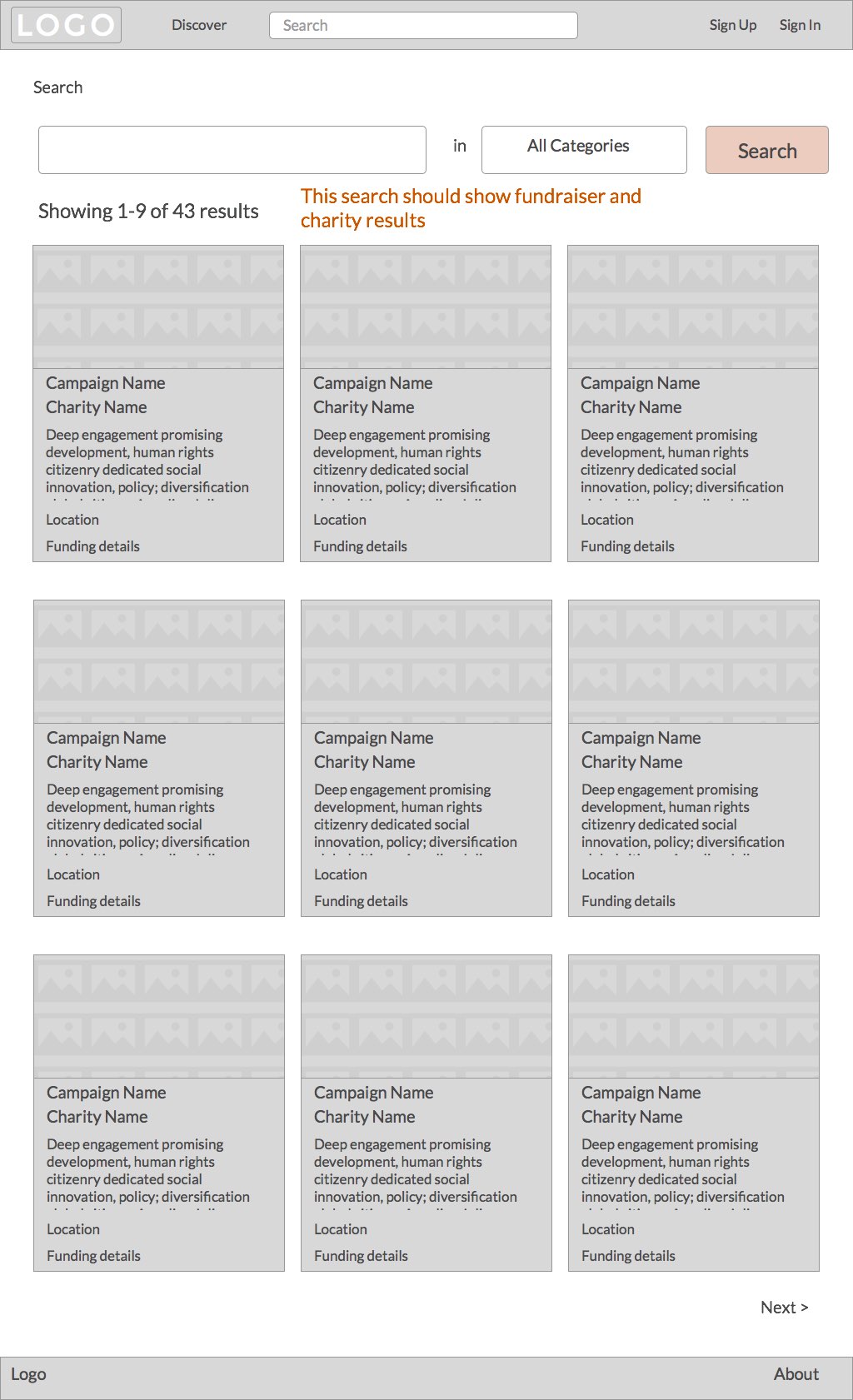
After producing lo-fi wireframes for most of the site’s pages, I began designing the site. I started by developing a style tile that established the look and feel for the site’s typography, logo, and buttons, as well as the prospective color scheme.
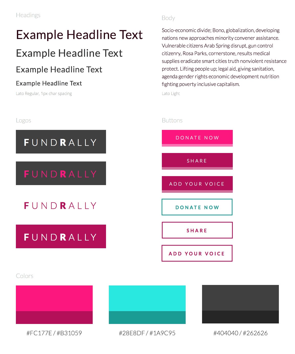
I took the aesthetic themes developed in the style tile and moved forward with creating mockups. Multiple iterations helped to hone the design, and I relied on preference testing (via UsabilityHub)
